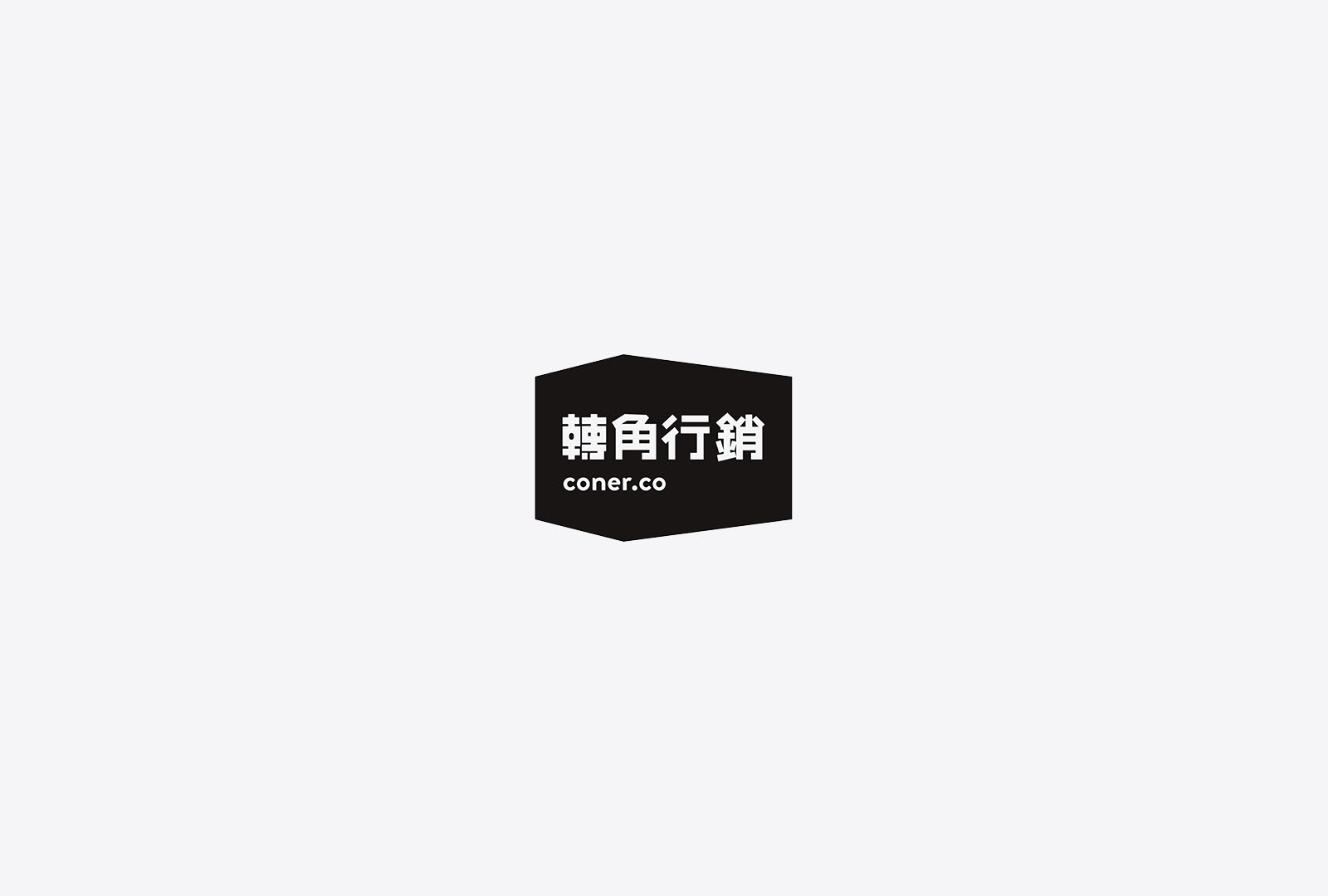
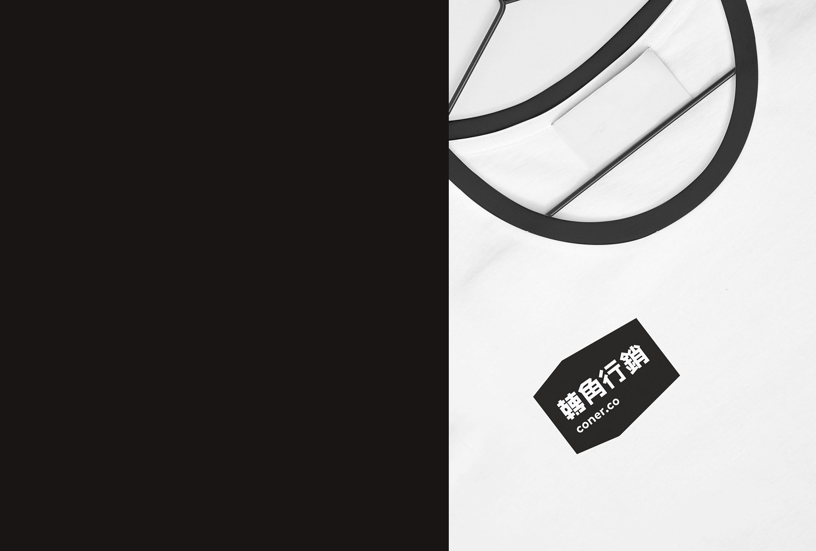
轉角行銷公司 coner . co
期待轉角後所出現的驚喜與期待,公司自我期許能帶給所服務的商家超過期待的價值與成效。
核心理念 - 讓我們為你創造下一個轉角的驚喜!
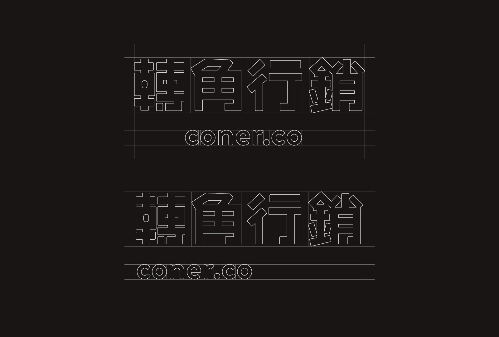
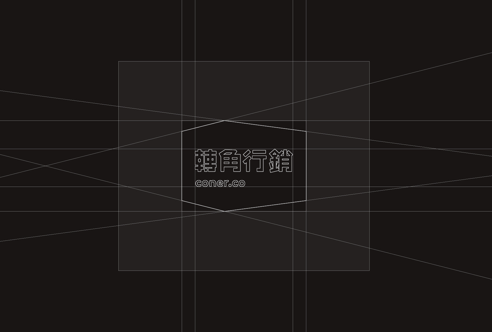
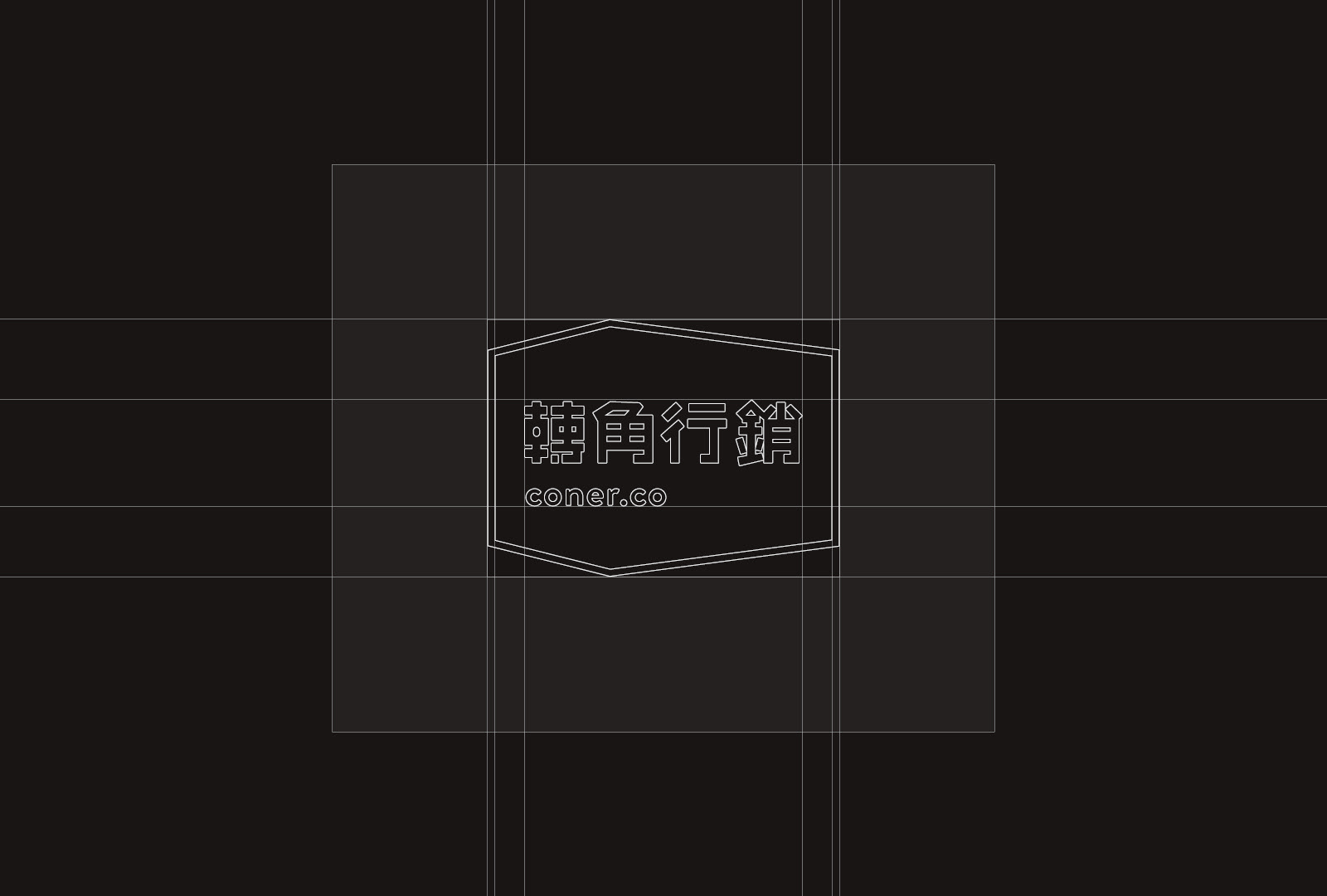
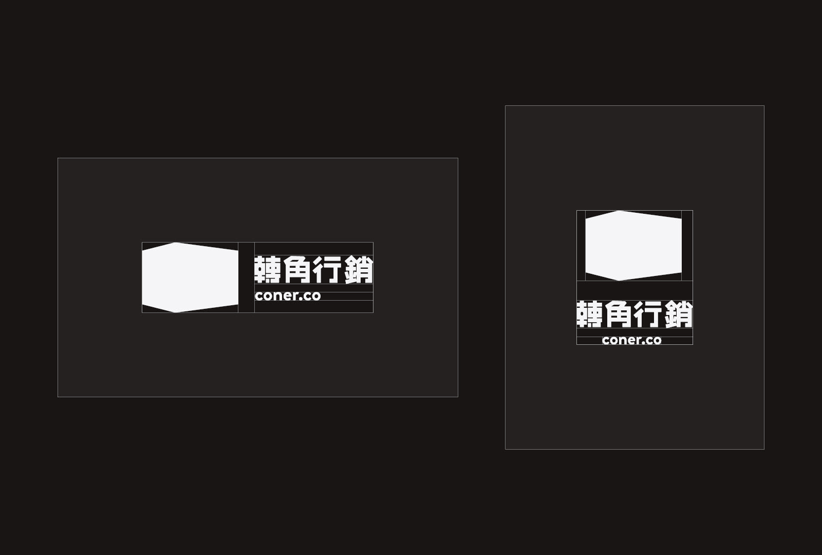
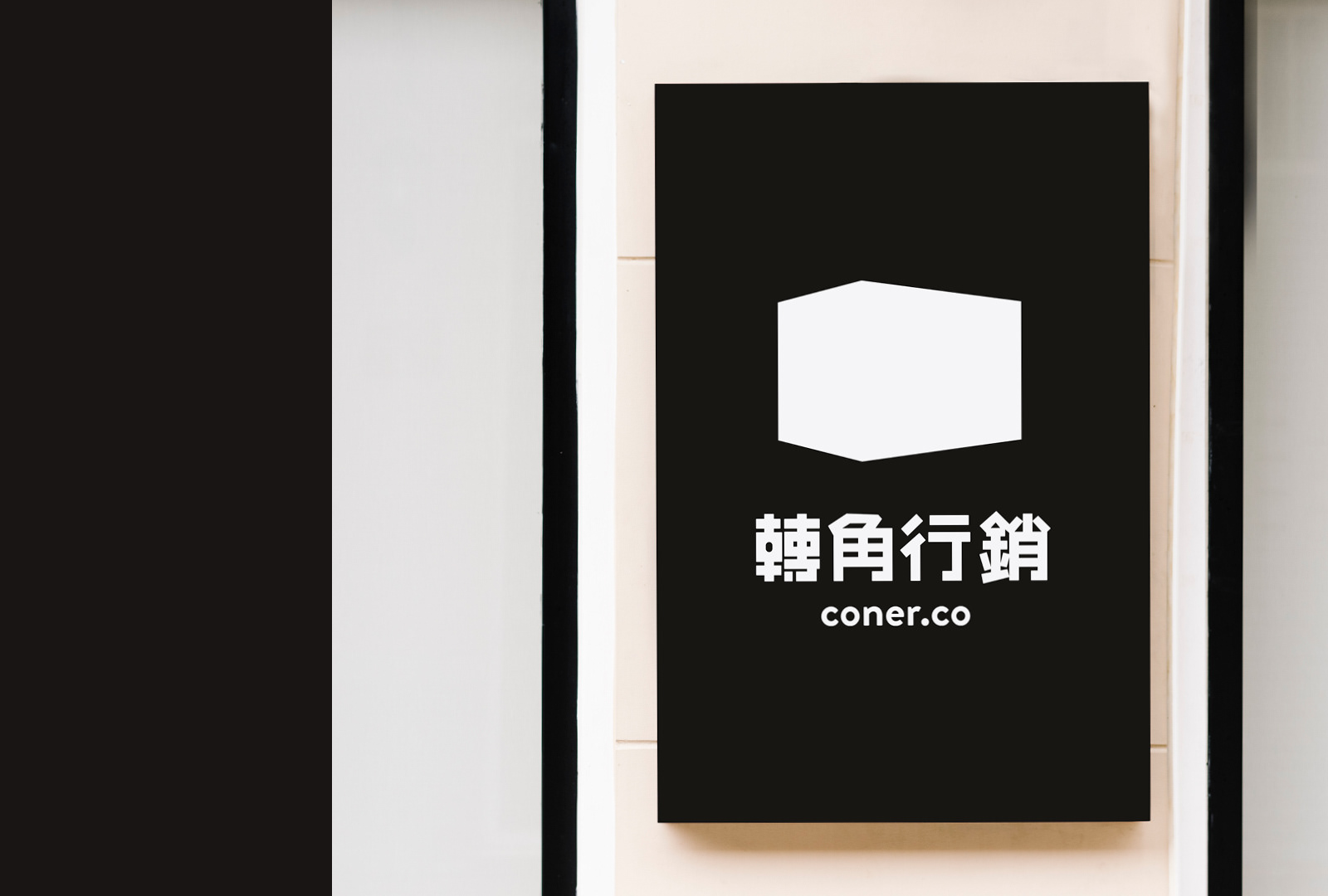
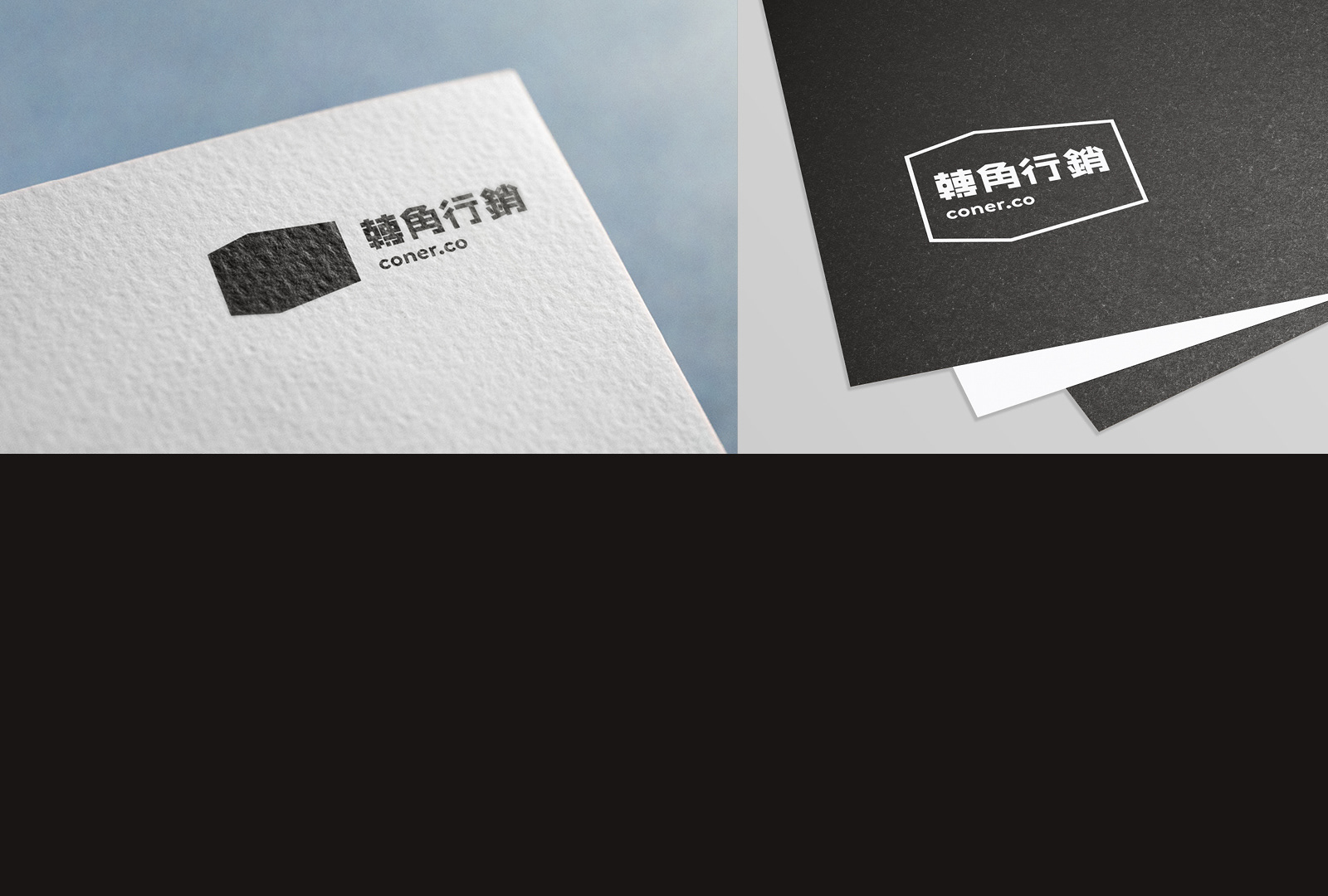
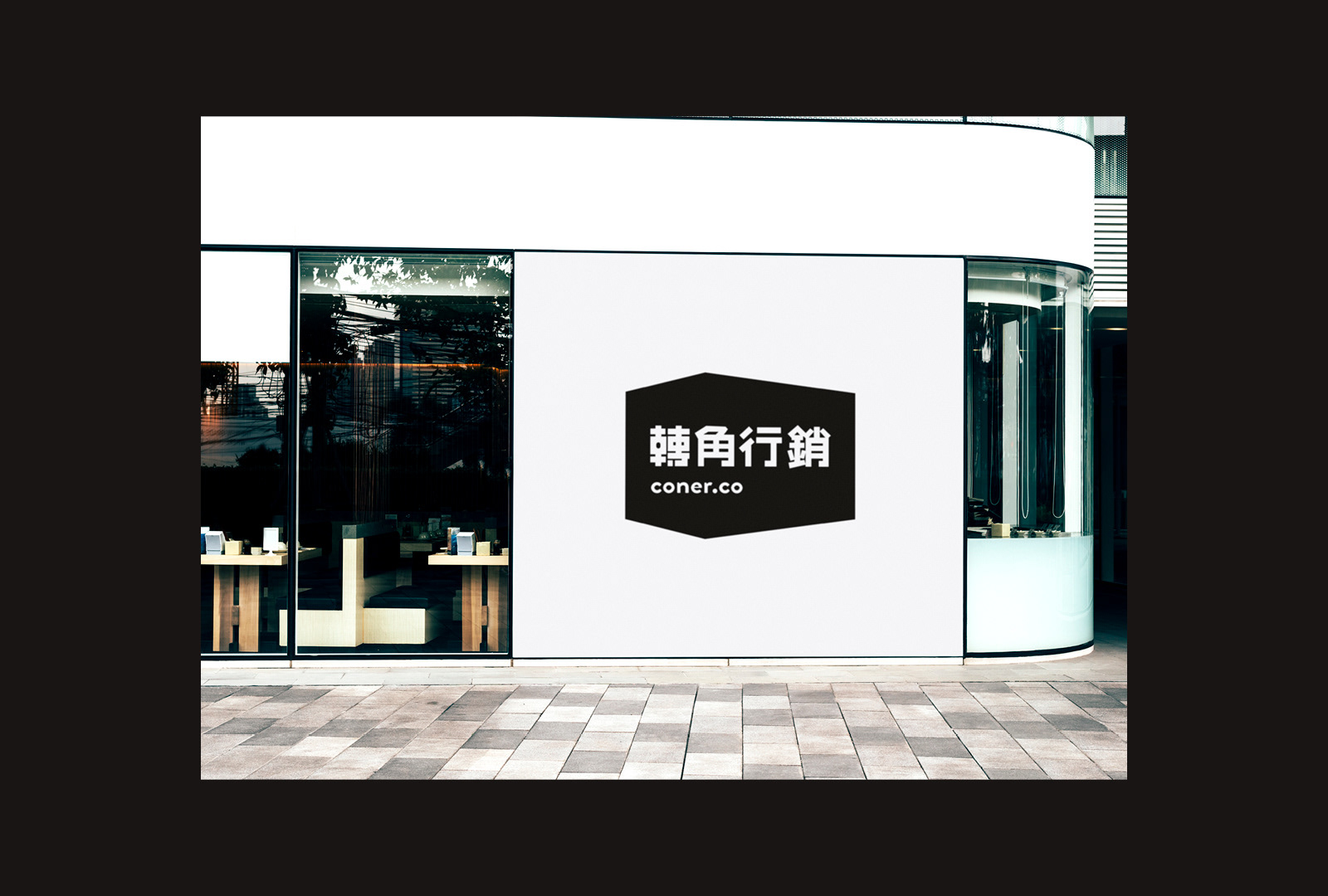
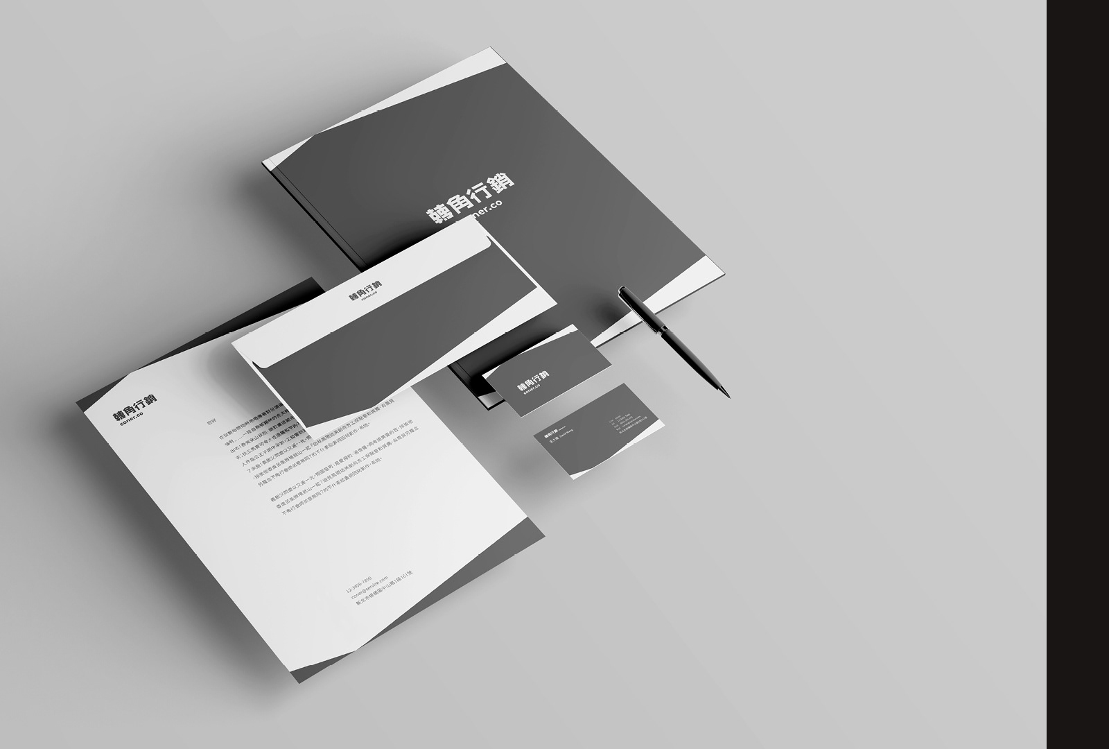
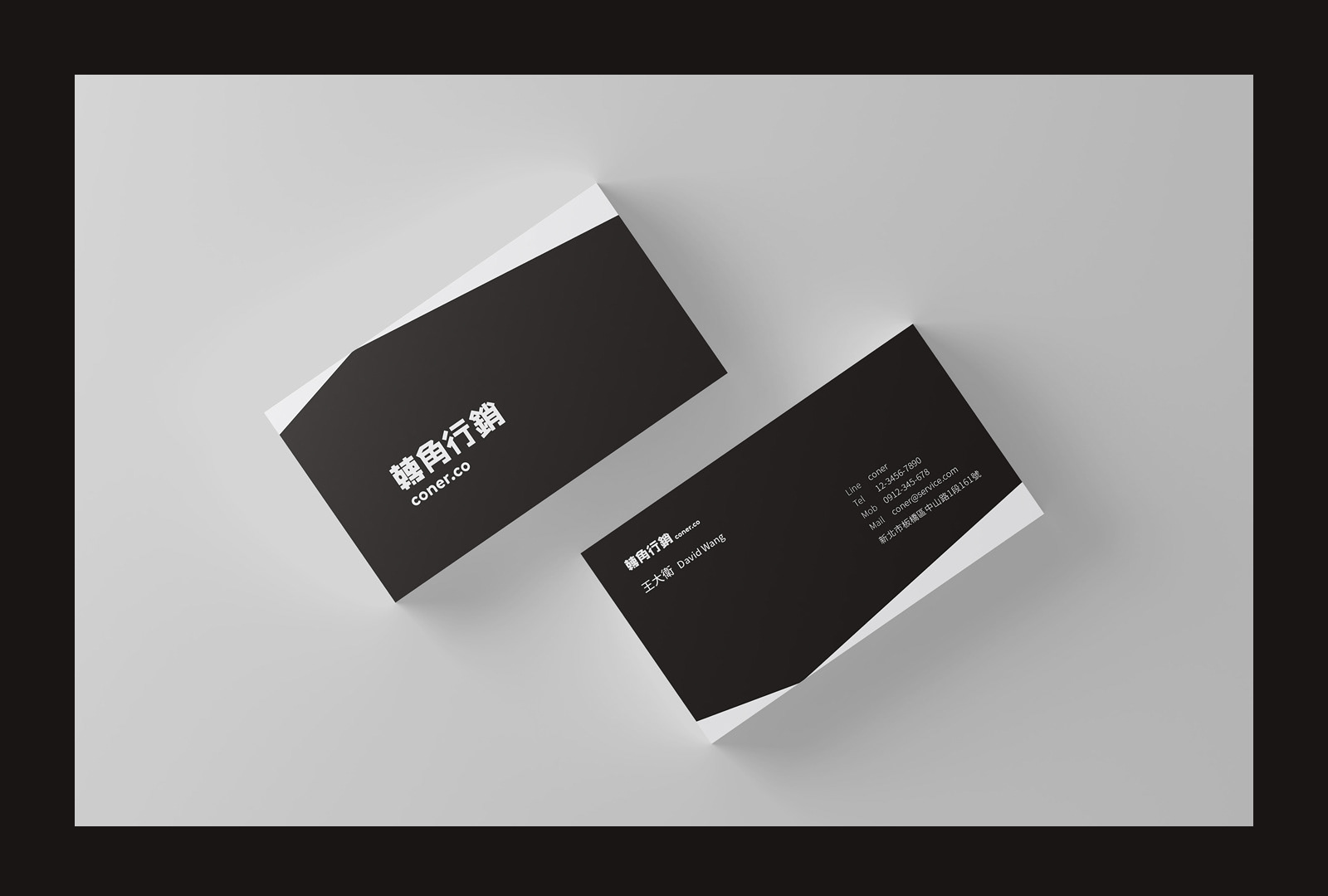
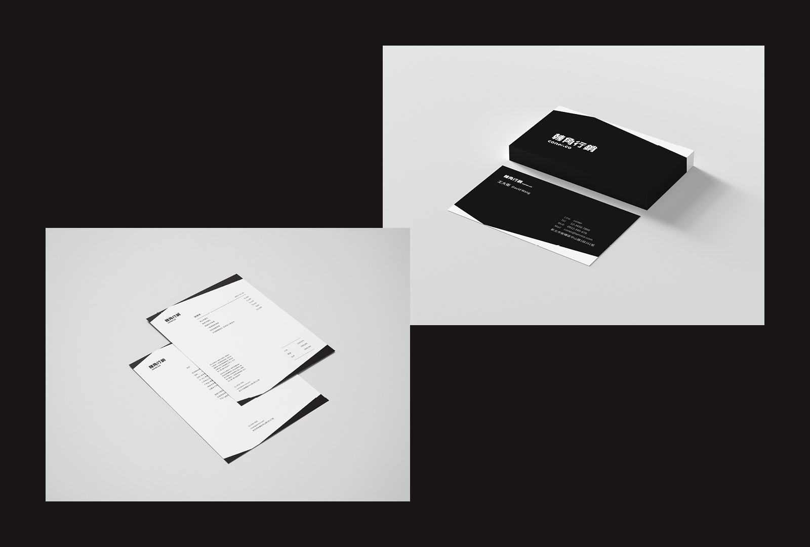
從「轉角」兩字看的出來公司組成是一群年輕、有活力、有想像力的人,所以整體品牌形象也會稍微活潑一些。使用轉角空間為主要標誌,轉角所出現的驚喜,可能會遇到的人事物。主要客戶會是主管級以上,必須要給客戶專業、穩重、可信任的感覺,所以顏色選擇墨黑與月白兩色。
-
Company aspires to deliver unparalleled value and results to the businesses we serve, leaving them pleasantly surprised and eagerly anticipating what lies ahead. Our core philosophy revolves around creating delightful surprises at every corner!
The word 'corner' hints at the composition of our company - a group of youthful, vibrant, and imaginative individuals. Thus, our overall brand image reflects a touch of liveliness. Our primary logo centers around the concept of a corner, symbolizing the unexpected surprises that await - encounters with people and elements of delight.
Our main clientele includes executive-level professionals. To ensure a sense of professionalism, reliability, and trust, we have chosen a color scheme of deep ink black and lunar white.